Theming and Language
Use custom styling, text, links, and images in your API Hub.
There are four different aspects of your API Hub for Business that you can customize: Assets, Global Navigation, Hub CSS, and Hub Strings. To customize the hub, Environment Admins can navigate to the Theming and Language tab of the Admin Panel:

Use the Theming and Language tab in the Admin Panel to customize your hub.
Assets
Images
In the Assets tab under Images, you can customize the Favicon (the browser's icon) and Homepage Hero for logged in and logged out states. The Homepage Hero is the main image shown on the API Hub page.
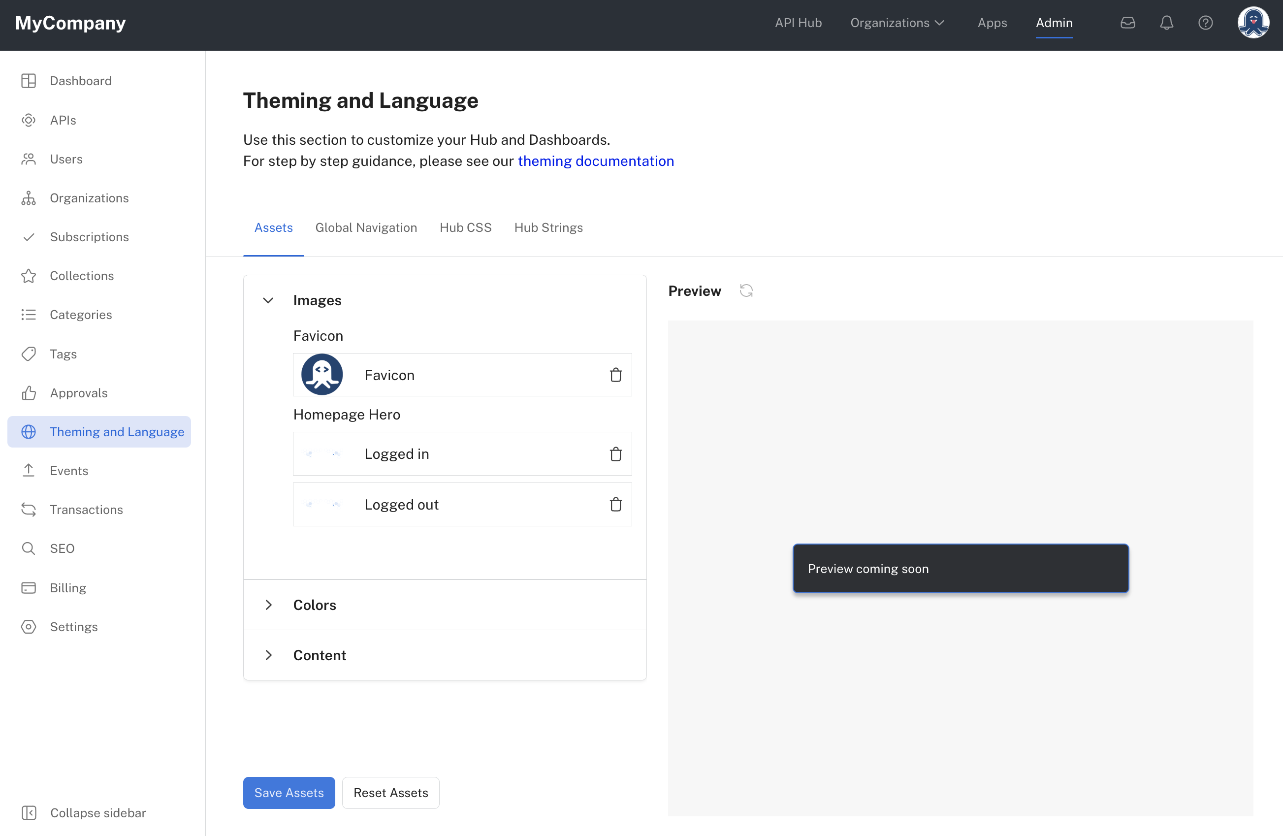
Configure Favicon and Homepage Hero images.
Colors
In the Assets tab under Colors, you can customize colors in the Developer Dashboard (Apps) and Organization Dashboard.
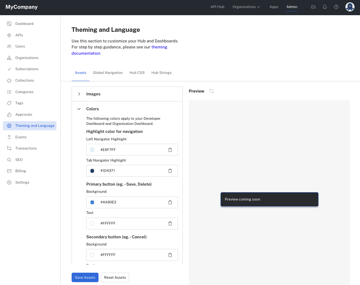
Customize dashboard colors.
Content
In the Assets tab under Content, you can customize page title tags. These are the names displayed when you hover over the page.
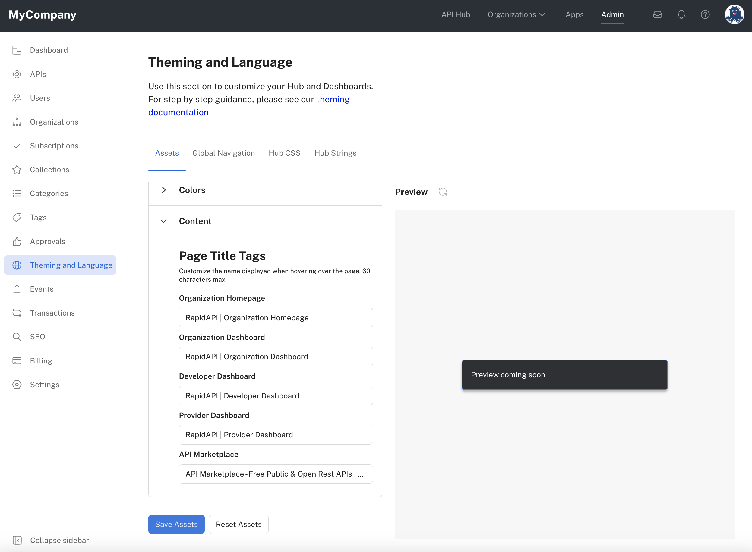
Customize page titles.
Global Navigation
The Global Navigation tab is used to set your company logo, header background color, header text color, font family, and other setting related to navigation.
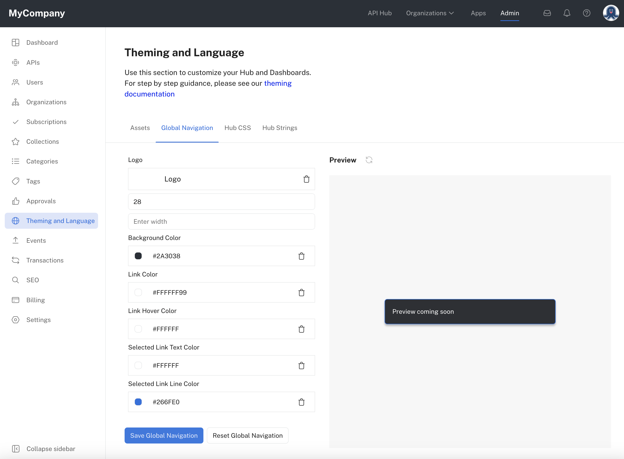
Use the Global Navigation tab for setting your company's logo and other navigation header customization.
Hub CSS
Use the Hub CSS tab to customize the CSS styles used in your hub. This includes the ability to customize light and dark mode styles, as well as typography.
Navigate to the Admin Panel and click Theming and Language in the sidebar. Under Custom CSS, click in the editing region to begin adding one or more custom CSS rulesets.
In the CSS provided, change the value of the properties to match your desired branding.
After modifying the CSS, click Save CSS. You can then view the associated user interfaces to see the effect of the change.
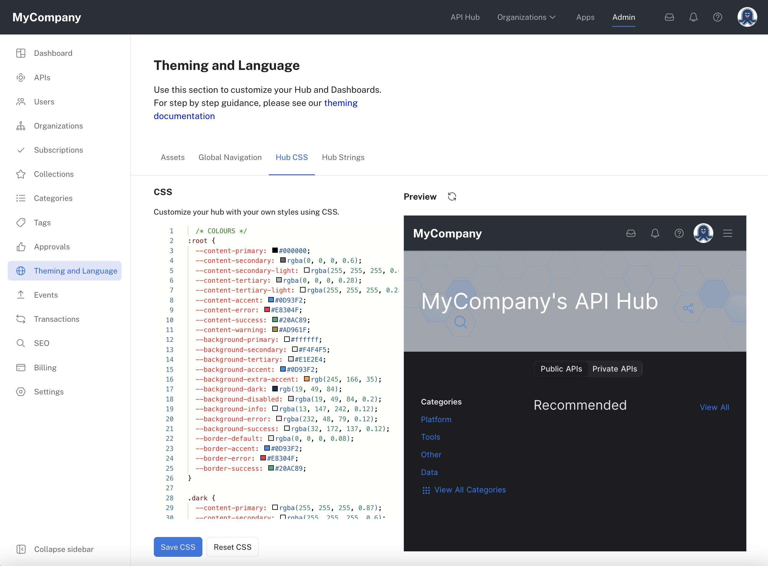
Customizing the hub's CSS rulesets.
Customizing colors
In the CSS, there are two rulesets related to colors. The first ruleset has a selector of ":root". This selects the root element of the document (usually the html element) and applies the rules to that element and all descendants. These colors apply in light mode of the API Hub. The second ruleset has a selector of ".dark", which selects for elements with a class of "dark". The colors here are used when the user interface is in dark mode.
Custom propertiesNotice that the rulesets related to colors have properties that begin with "--". In CSS, these are special properties called custom properties (sometimes called CSS variables). Changing the value of a custom property changes its value everywhere the custom property is used (using a var() CSS function). For more information on var() CSS functions and custom properties, see this page.
Determining which color-related property values to change
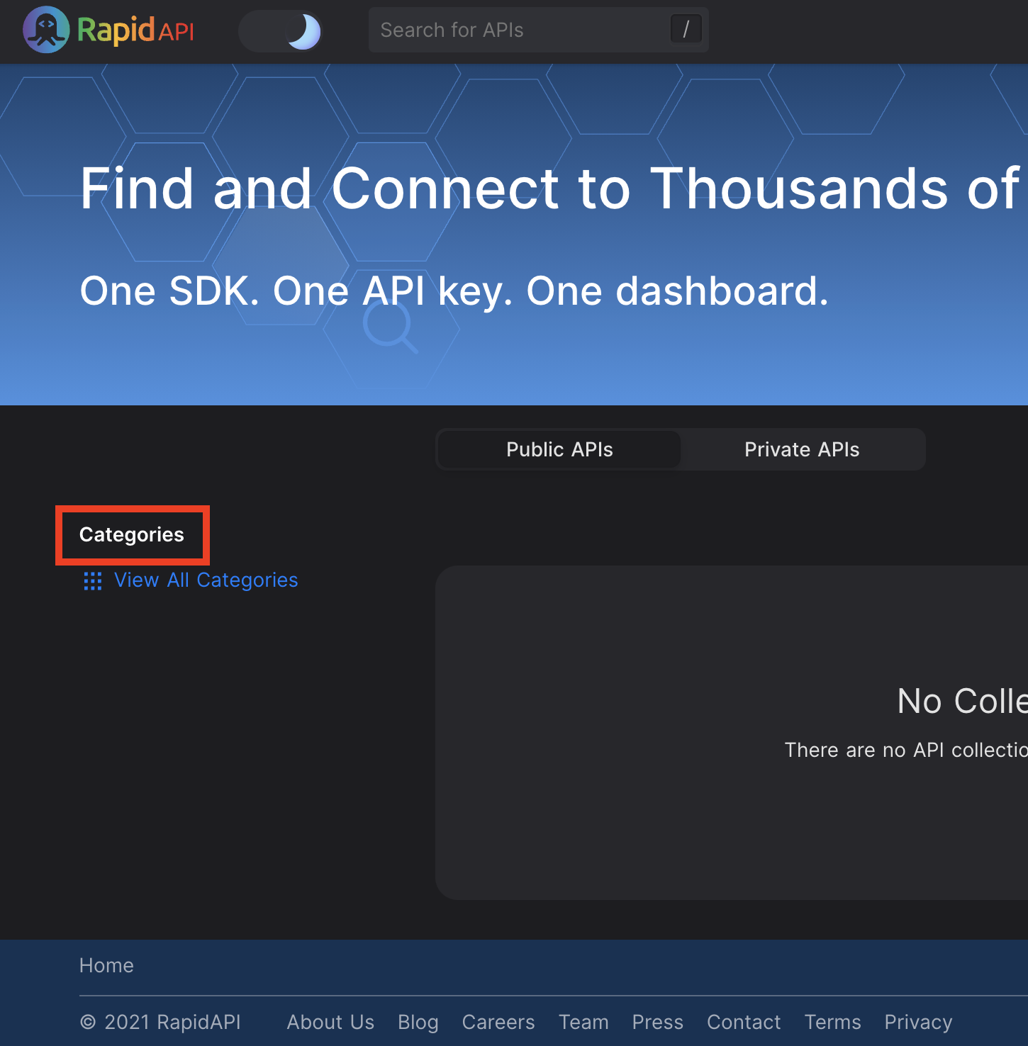
If you want to change a color such as a background or text color, one way to identify the appropriate ruleset to change is to use the Inspect feature of most modern browsers. For example, let's assume that you want to change the color of the "Categories" label on the Enterprise Hub, as shown here:
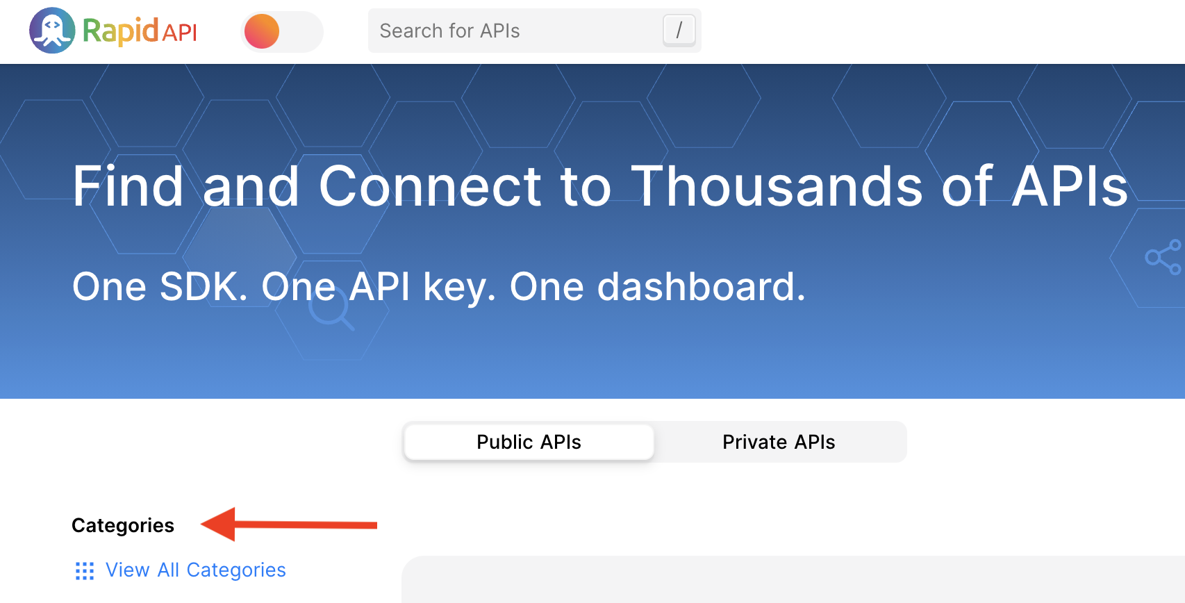
You can select the "Categories" text, right-click, then click Inspect. (Here we are using Google Chrome.)
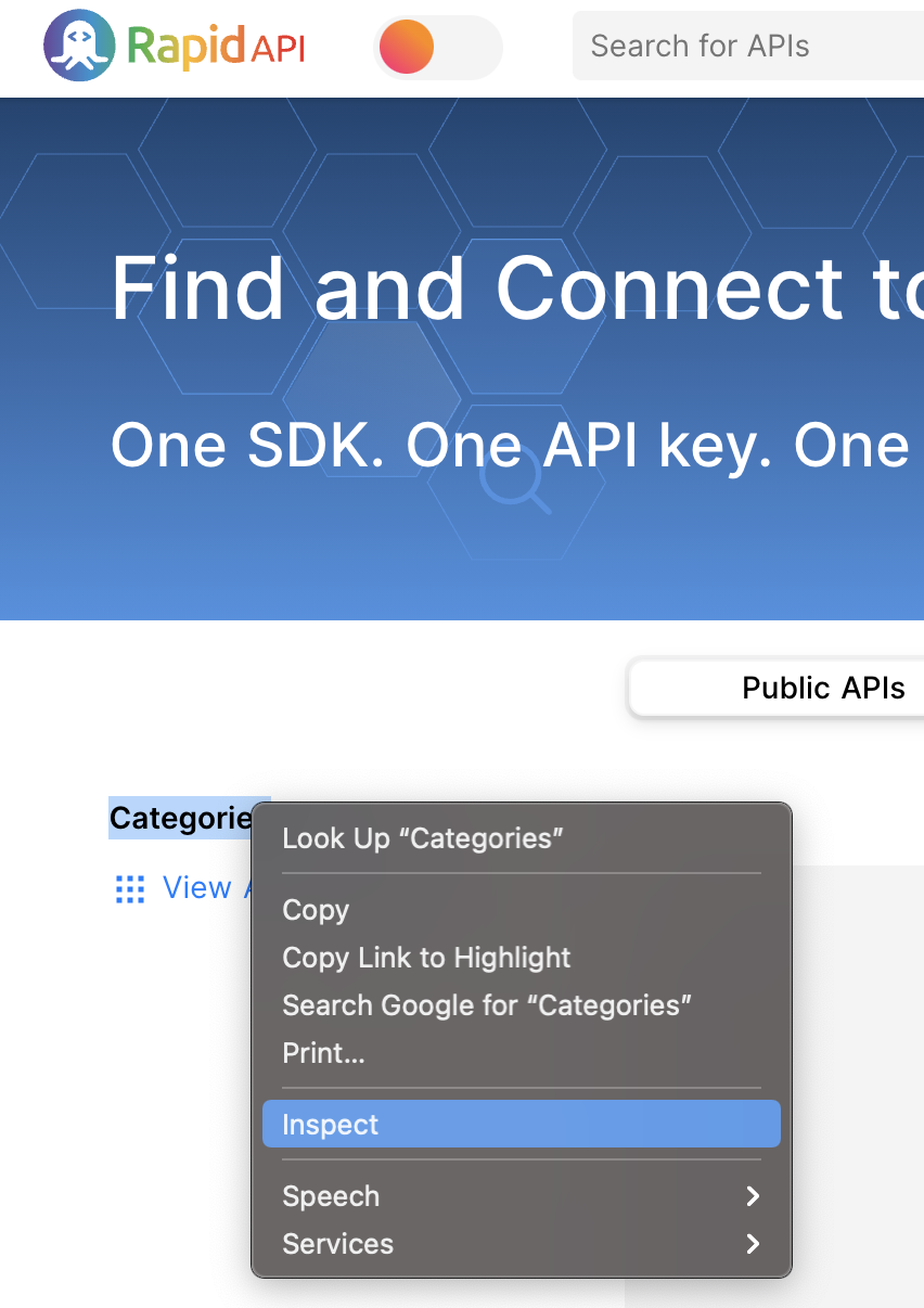
You can then view the Styles for the selected element and see that the color property is set to the value of the custom property named --content-primary.
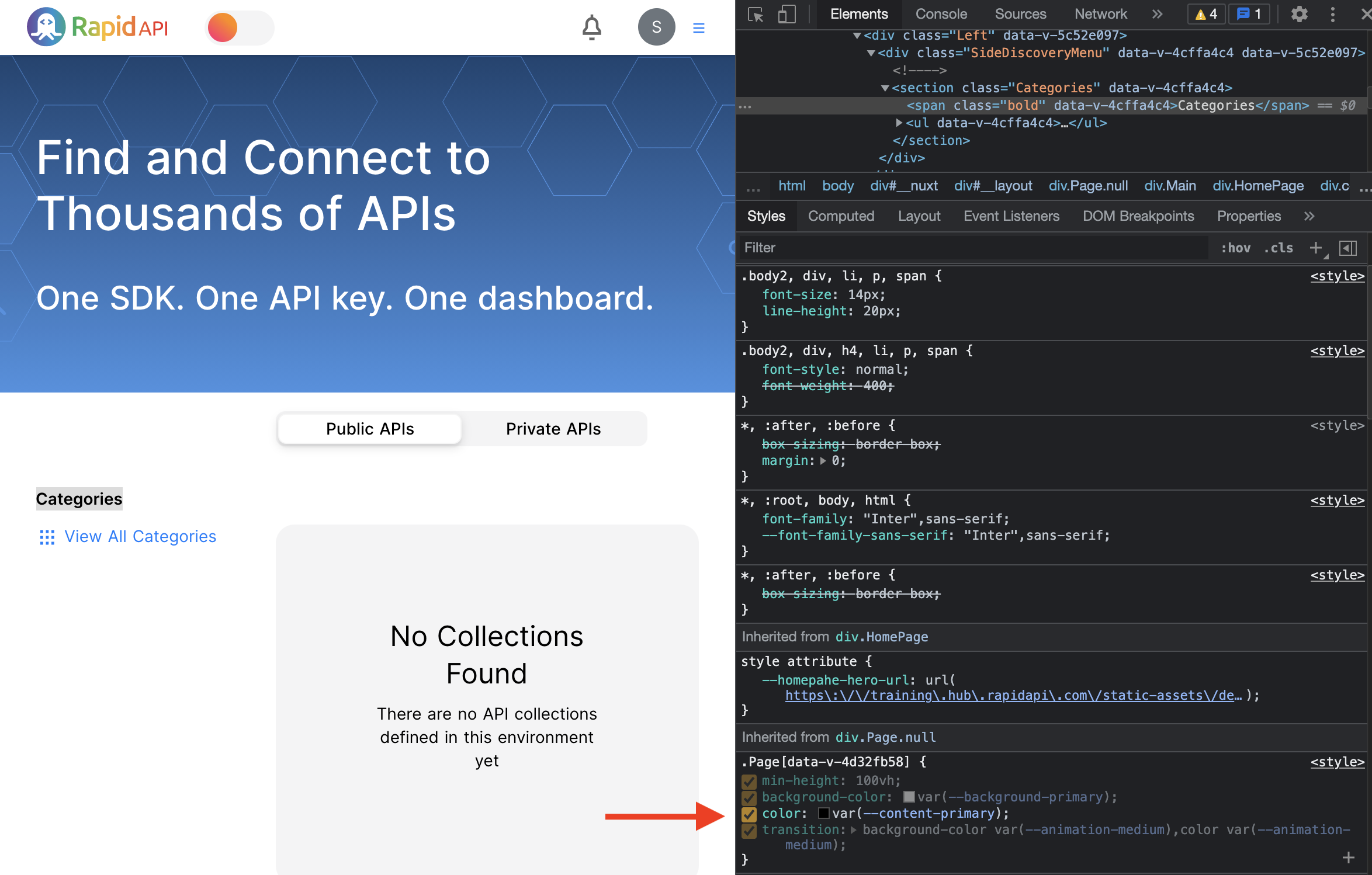
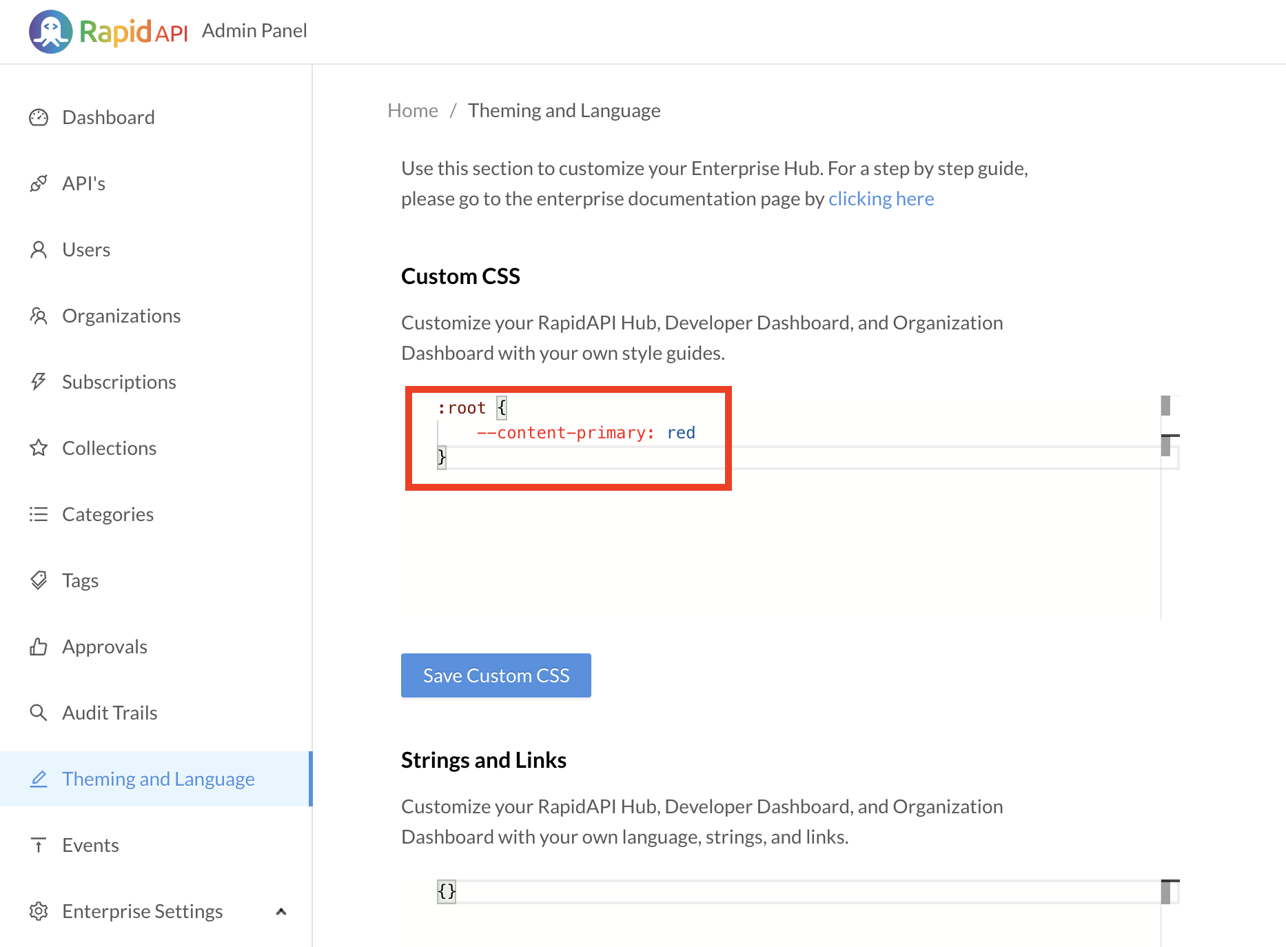
You can then see that the --content-primary custom property is part of the default stylesheet (shown below). To customize the color, you can add the following ruleset to the Custom CSS area, changing the color to red:
:root {
    --content-primary: red;
}
After clicking Save CSS, you can view the Hub and see that the color of the text has changed to red:

Notice that changing the "--content-primary" value to red affects the color of other text too. If, for some reason, you want to ONLY change the "Categories" label to red, you could use a different approach. You could Inspect the Categories label again and see that the Categories area is a "section" HTML element with a class named "Categories". You can see that the Categories label is in a "span" child of the "section" element:
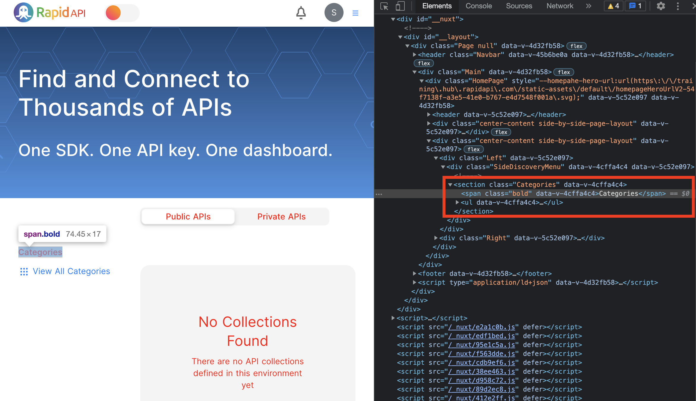
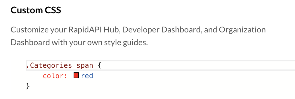
To only change the color of the "Categories" label, you could change the custom CSS to select only for "span" elements that have an ancestor element with a class named "Categories", as shown here:
.Categories span {
    color: red;
}
Do not use object tags in your custom CSSDo not include specific object tags ("data-v-*") in your custom CSS. These object IDs are subject to change.
For example, instead of a selector such as this:
.NavbarProductLink.SelectedProduct[data-v-abcd]use a selector such as this:
.NavbarProductLink.SelectedProduct
This results in only the Categories label text changing to red:
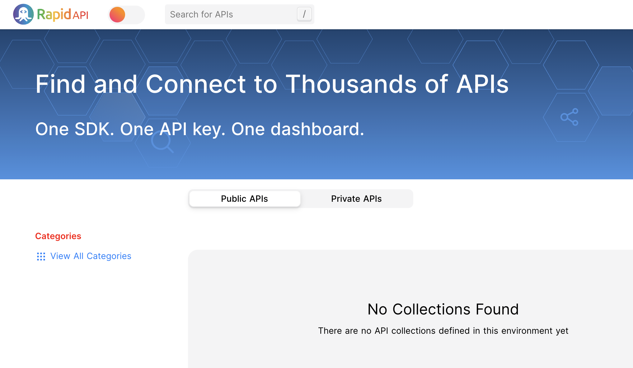
Notice that you have added your own ruleset to the page. RapidAPI "injects" this ruleset into the page behind the scenes, displaying your customizations.
Clearing custom rulesetsOnly the rulesets that are included when clicking Save Custom CSS will be injected by RapidAPI. Therefore, to "undo" all CSS customizations, you can enter an empty rule {} under Custom CSS and click Save Custom CSS. Since there are now no custom rulesets, RapidAPI does not inject any custom CSS.
Customizing dark mode
The ruleset with a selector of ".dark" selects for elements with a class of "dark". The colors here are used when the user interface is in dark mode.
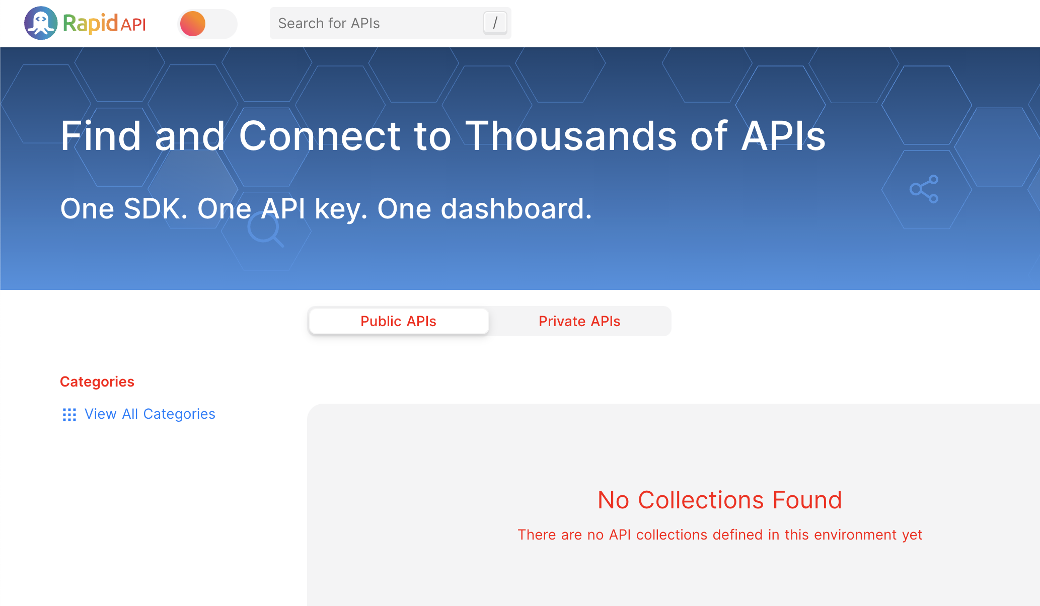
In an earlier example, the primary text on the hub was turned red using this customization.
:root {
    --content-primary: red;
}
If you use the toggle in the upper left to switch to dark mode, you see that the primary text is white, not red:
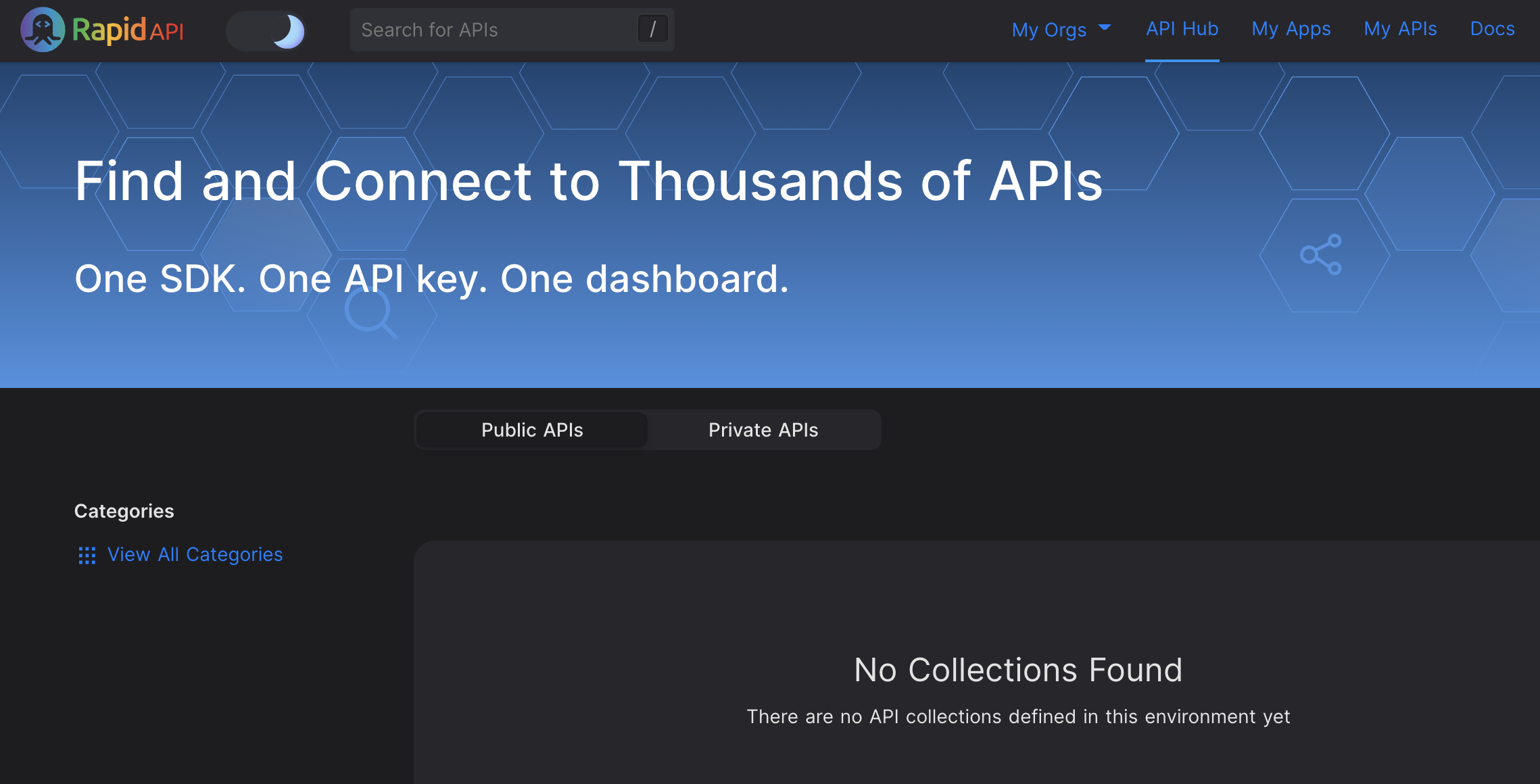
This is because in the ".dark" selector of the default RapidAPI stylesheet , the "--content-primary" custom property value is set to white. This selector has higher specificity than your customization, so this selector is used to set the color in dark mode.
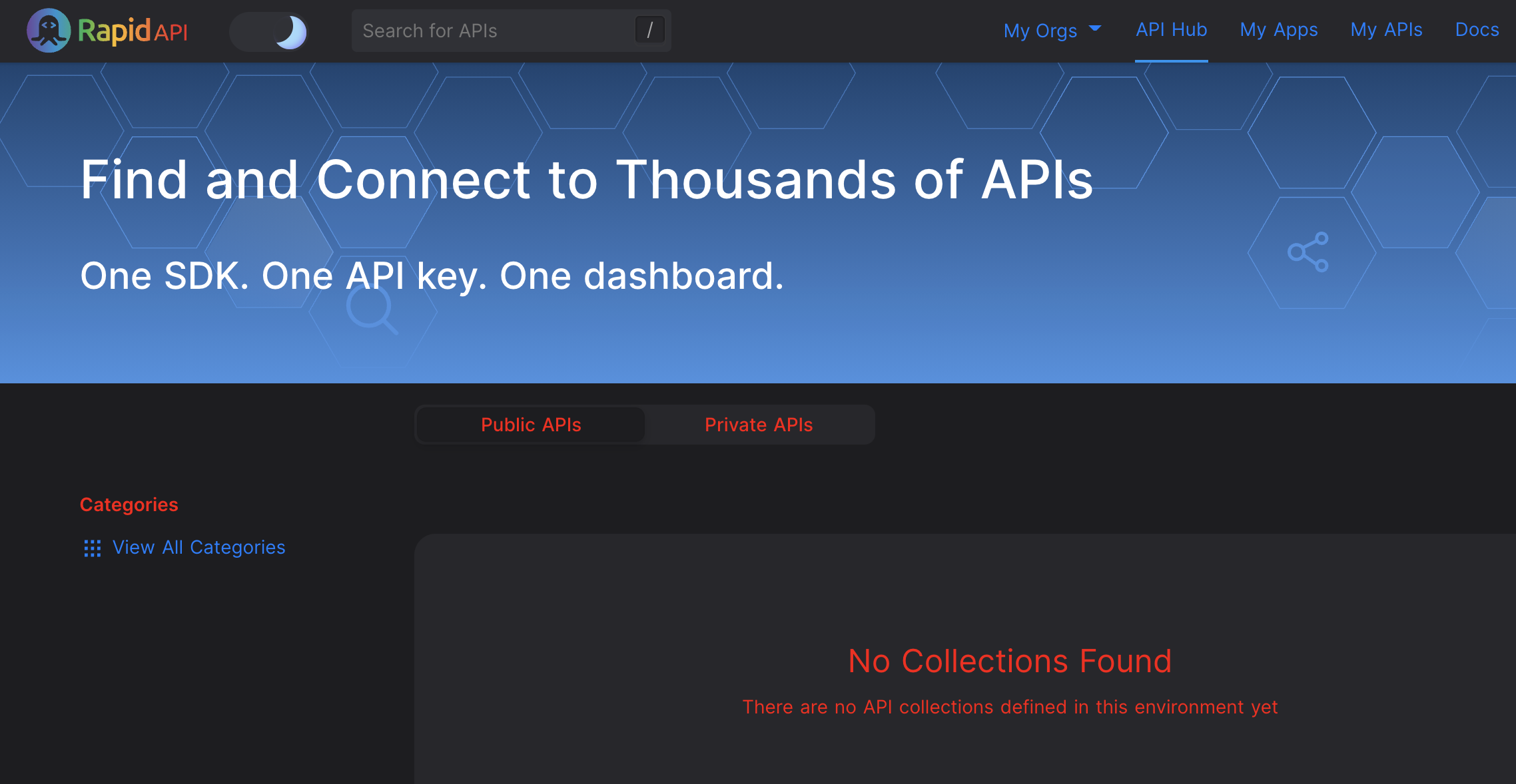
If you want to also change the primary color to red in dark mode, you would include another ruleset in your custom CSS:
:root {
    --content-primary: red;
}

.dark {
    --content-primary: red;
}
In another earlier example, only the "Categories" label on the Hub was turned to red using this ruleset:
.Categories span {
    color: red;
}
This customization turns the Categories label red in both light and dark mode.
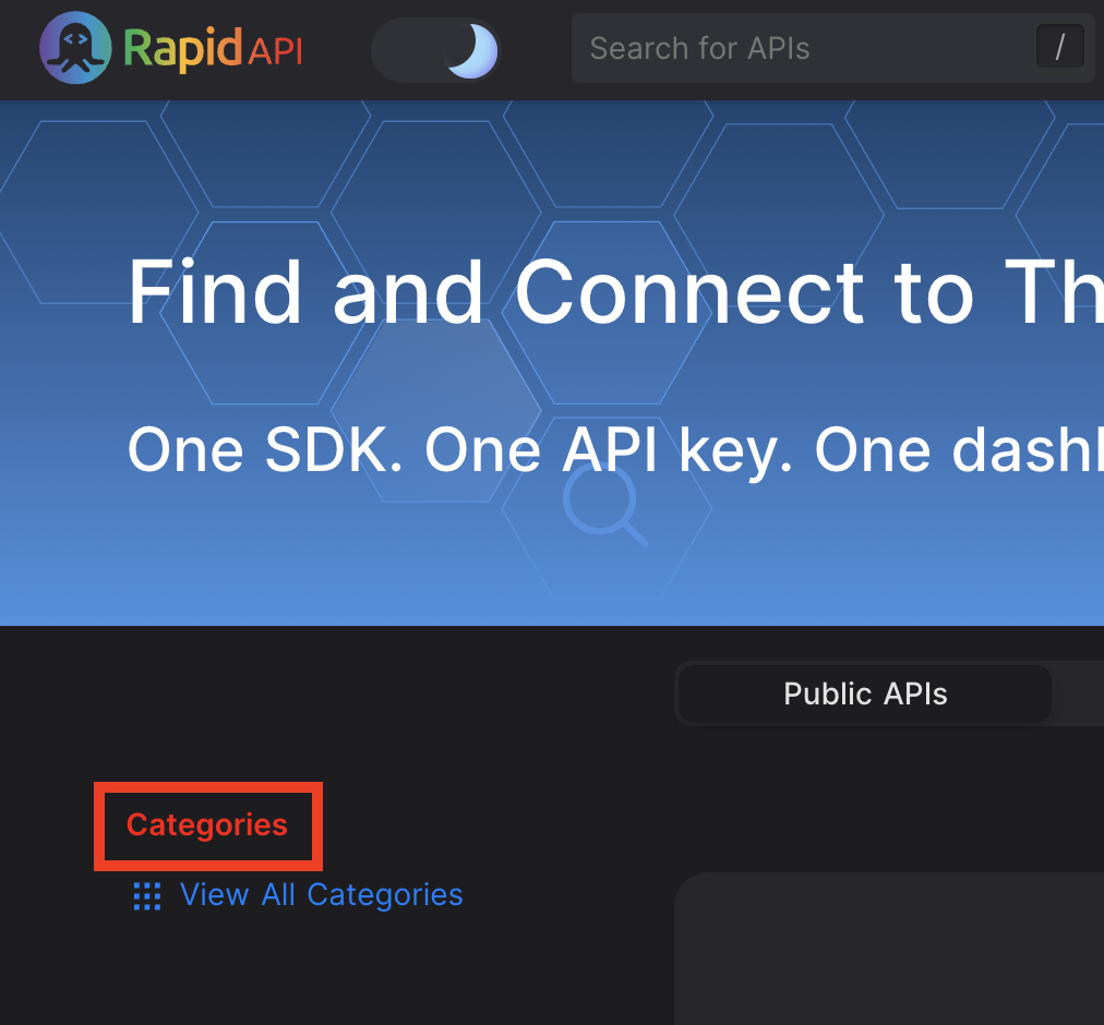
Let's assume that we want to display a white Categories label in dark mode. To achieve this, we can add a selector that includes the "dark" class. In dark mode, this selector is more specific than the previous selector, so it will be applied and the label displays as white:
.Categories span {
    color: red;
}
.dark .Categories span {
    color: white;
}
Customizing typography
The TYPOGRAPHY section in the CSS is used to change things like font family, font size and font style of the various types of text (headers, body, etc.) used in the RapidAPI user interface. To change values related the typography, copy any rulesets that you want to change to the Custom CSS section and make changes to the values as desired.
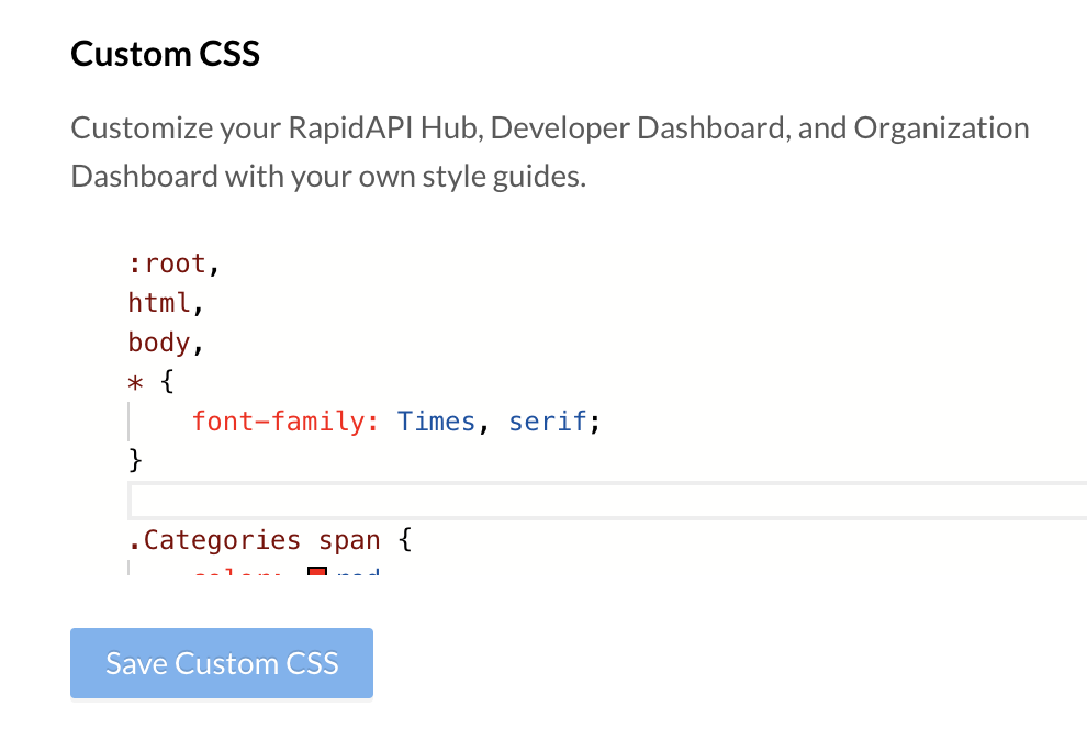
As an example, here is a ruleset that changes the font-family to "Times, serif". Notice that the previous ruleset is also included in this CSS. Otherwise, the previous customization would no longer be in effect.
:root,
html,
body,
* {
    font-family: Times, serif;
}

.Categories span {
    color: red;
}
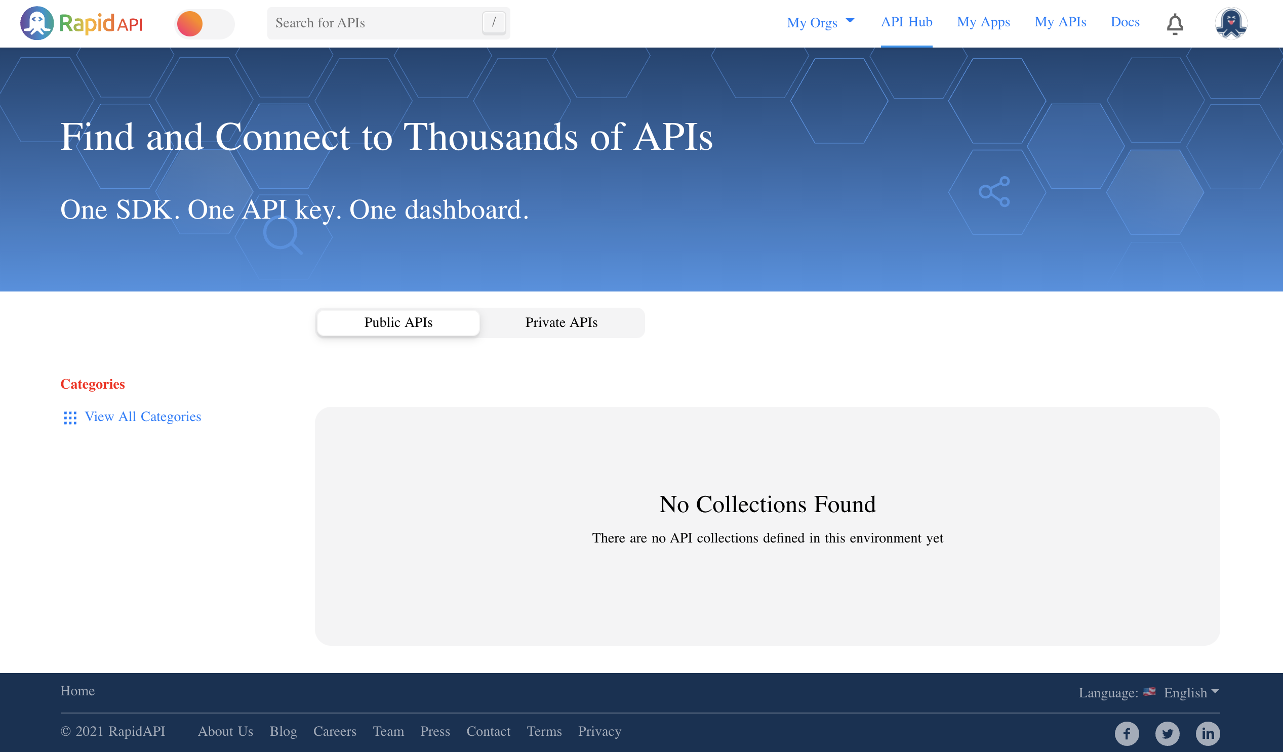
Clicking Save CSS results in a change of the fonts (as well as the previous customization):
Tip: Store your custom CSS in version controlIt is best to store your custom CSS in a version control system and copy the code to the RapidAPI interface. This allows you to see the history of changes and to revert to an older version if necessary.
Hub Strings
Use the Hub Strings tab to customize the text strings and links used on the API Hub.
Customizing page titlesTo customize the value of the HTML title tag for any page on your hub, please see SEO (Search Engine Optimization).
The Strings and Links section expects you to add a single valid JSON object. RapidAPI provides a default JSON object containing all of the strings that are customizable.
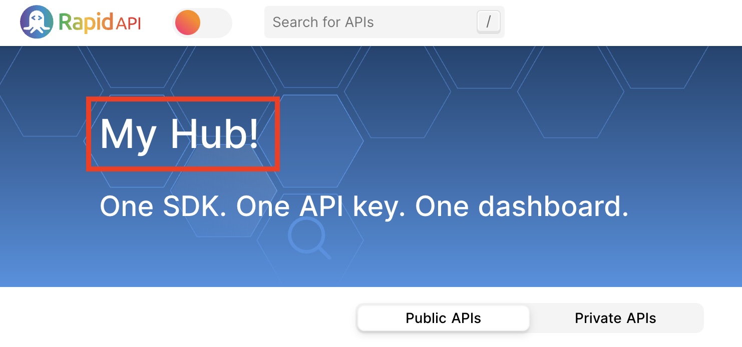
As an example, to change the main message on the Hub's homepage, you can change the following part of the JSON in the Strings and Links section and then click Save Strings and Links.
{
    "indexPage": {
        "hero": {
            "title": "My Hub!"
        }
    }
}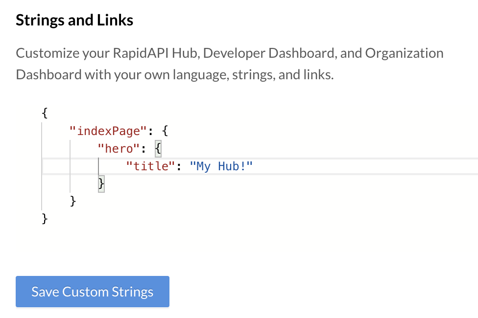
Notice that this JSON object has a single property named "indexPage", which represents the main hub homepage. The value of the indexPage property is another object with a property named "hero", containing another property named "title". You change the value of the "title" property to change the text displayed on the Hub, as seen here:
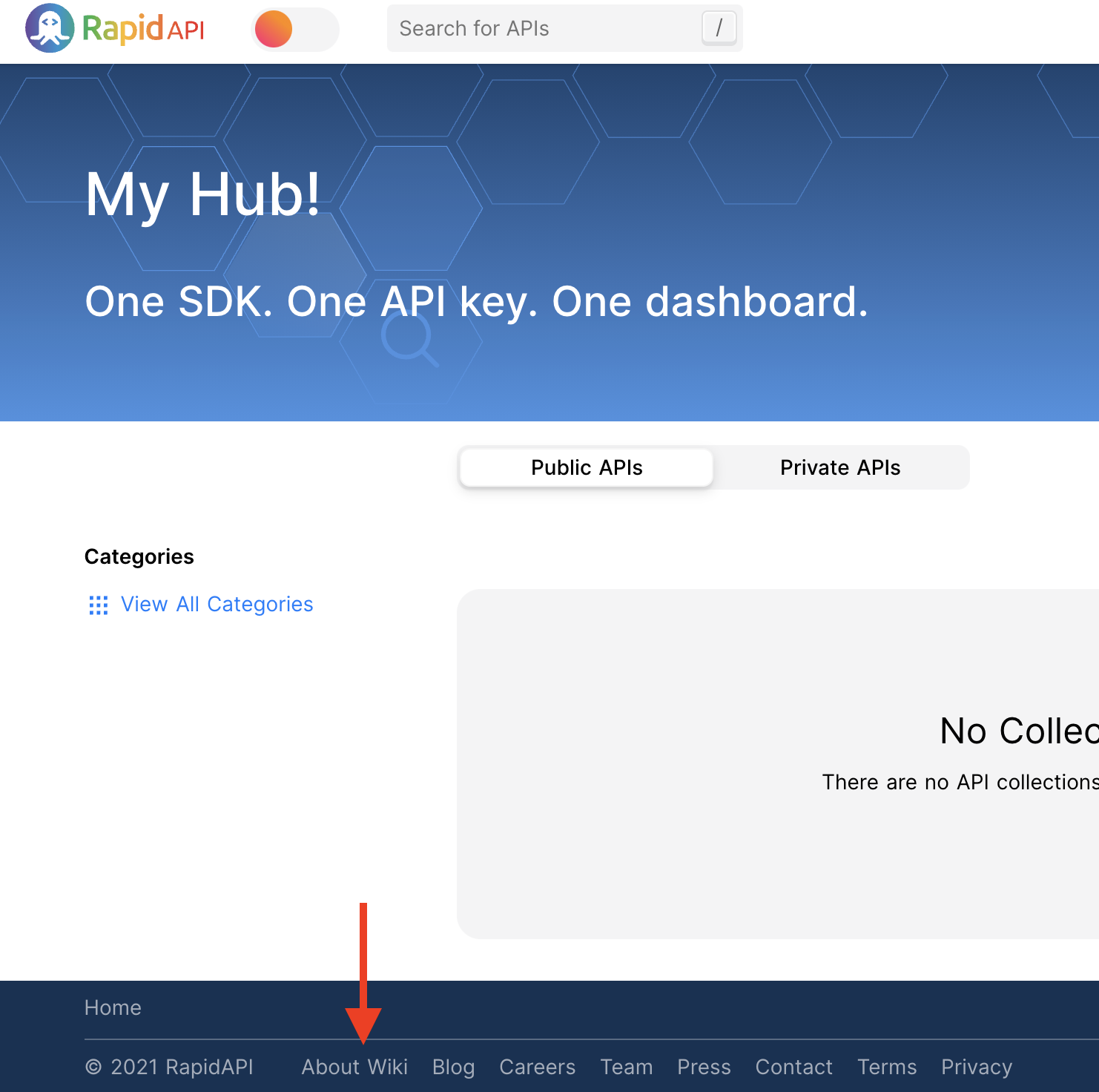
As another example, you can change the text and URL of the "About Us" link in the footer. Here, the About Us text is changed to "About Wiki", and the link points to a Wikipedia page. Notice that the value of the "links" property is an array []. Notice that the previous customization is also included in this JSON. Otherwise, the previous customization would no longer be in effect.
{
    "Footer": {
        "links": [
            {
                "label": "About Wiki",
                "link": "https://en.wikipedia.org/wiki/About"
            }
        ]
    },
    "indexPage": {
        "hero": {
            "title": "My Hub!"
        }
    }
}
Tip: Removing one or more footer linkTo "remove" an existing link, simply change the value of its label to "". For example, to remove the Press link, change "label": "Press" to "label": "".
As another example, you can change the text of the copyright notice. Here, the company name is changed to "My Company". Also, instead of a hard-coded year, the year is parameterized using {currentYear}. Notice that the previous customization are also included in this JSON. Otherwise, the previous customization would no longer be in effect.
{
    "Footer": {
        "links": [
            {
                "label": "About Wiki",
                "link": "https://en.wikipedia.org/wiki/About"
            }
        ],
        "copyrightDisclaimer": "© {currentYear} My Company. All Rights Reserved."
    },
    "indexPage": {
        "hero": {
            "title": "My Hub!"
        }
    }
}
Tip: Store your custom JSON in version controlLike all configuration code, it is best to store your custom JSON in a version control system and copy the code to the RapidAPI interface. This allows you to see the history of changes and to revert to an older version if necessary.
Notes on JSON syntaxIn the JSON syntax, values that include pipes (|) represent pluralization in a formant called Symfony. Values containing curly brackets {} include placeholders in ICU Message Format.
Updated 11 months ago